
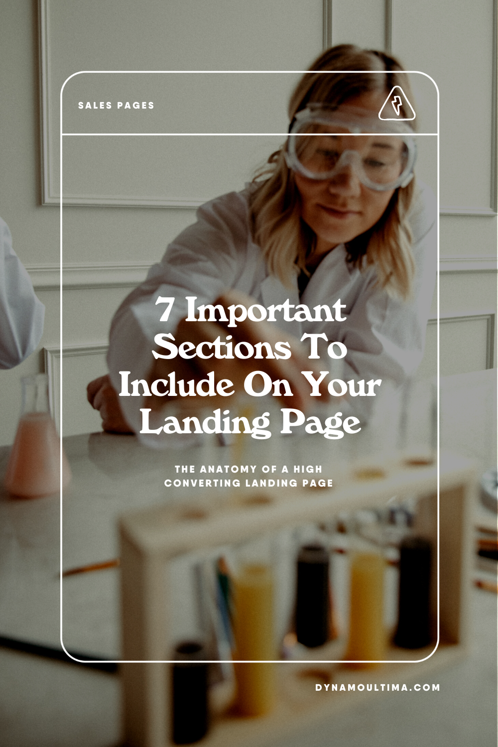
7 Things To Include On Your Landing Page

A clear date & time of your workshop or masterclass if you are hosting something live
The most important thing to point out is WHEN - if you are hosting a live workshop, notifying people of your workshop date, timezone, etc is the first thing they should see for obvious reasons. This can be placed in multiple places throughout your page, we love to use a Marquee or Scrolling block on Squarespace to really catch attention - it’s also important to use a color that will stand out.

A catchy descriptive title + tagline with a clear CTA underneath
The title for your workshop should sound exciting but also be clear. It’s always more important to be clear over clever - for our workshop we hired a copywriter to help us come up with the copy for our landing page! She took my idea “Branding your offers workshop” to “how to brand your next bomb idea” and made it sound so much more exciting! Highly recommend a copywriter if you have the funds. I recommend Reveal Studio!
Design TIp:
Create a custom LOGO for your offer!
Details on who the workshop is for
It’s important to get clear on who exactly would benefit from your workshop or free offer. Showcasing a list of things that pertain to your audience can be super helpful in getting more conversions on your page. Make sure you spend time thinking about your audience, and try not to be too vague about it. Clarity & being specific is key!
Also, please don’t list out a 1000 things, stick to 3-4 details about who your offer is for. We don’t want to overwhelm people with too MUCH.
Design tip:
I always love to highlight these points in boxes, or bullet points so that it stands out more than just a text box.

Paint the vision of your audience & where they want to be
Just IMAGINE.. this is the part where you show them what life will look like after the workshop. Will they be millionaires? Will they know exactly how to make the best damn chocolate chip cookies on planet earth? Show them what the benefits are of your offer!
Design Tip:
In this part of the landing page I love to use columns in threes or fours! Visual elements like photos or icons can really help paint the picture for your audience & can add dynamic elements on the page that make it more fun to interact with.

Your credentials and why they should trust you
Why do you have the skills and expertise to teach whatever it is you are teaching? Share your expertise with your audience and give them an idea of why this particular topic is important to you.
Design Tip:
Use a photo of your face! And try to use a photo that feels professional but also approachable.
What do they get when they sign up & how does it work?
Make it clear what they will recieve when they sign up and what they should expect! Will you send them an email right after? Will they be redirected to another page? What do they get with the workshop or free offer? A workbook? A template? A live call?
Design Tip:
My favorite way to create VALUE with presenting a digital offer is to use GLAM SHOTS - these are essentially digital mock ups (aka an artistic rendering of a product that showcases the product in action.

Ask them again to sign up with a clear CTA on the bottom of the page.
Last but not least, ask them again to enroll and give a short description on why they would enjoy it, when the workshop is hosted, and any other small details they need to know.


