ROOTED
Industry: Wellness + Yoga
Service: Brand & Website Package
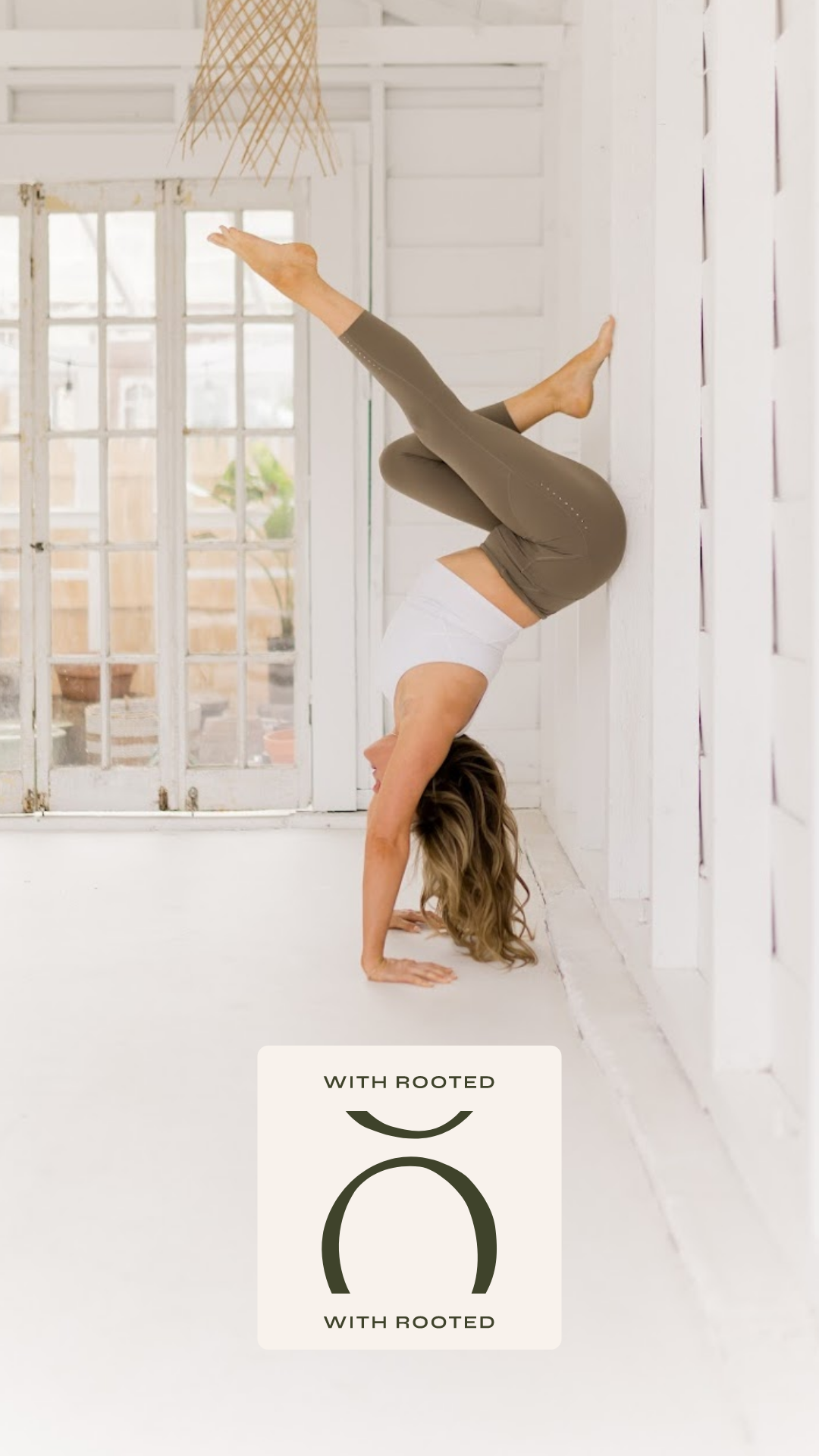
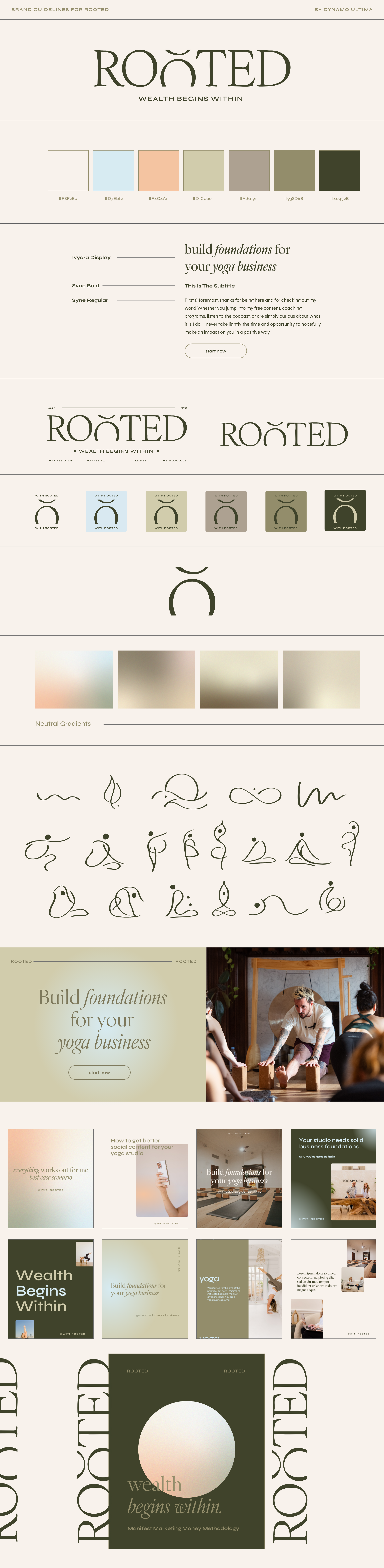
Kate and Patrick are on a mission to help yoga teachers build profitable, sustainable careers. Their brand needed to feel earthy and grounded without feeling flat so we leaned into greens and blues for calm, added a pop of coral for warmth, and kept everything clean but full of life. The logo is a subtle nod to an "O" being planted in the ground growth, roots, strong foundations.
OH MY GOODNESS! We're obsessed! I feel like we were never able to fully articulate what we were trying to create and somehow you and Cody understood and brought it to life. I'm blown away by the level of creativity the two of you have and are able to do in such a short period of time.
— Kate Lombardo
Ready to make something you love that much? Book your project →